Metronome Mk 4
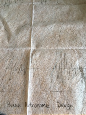
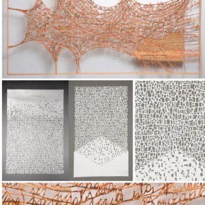
Posted: April 8, 2016 Filed under: Subject, Subject Level 6 Leave a commentI decided that I wanted to try a layered approach to this metronome, so I drew a basic design (see left pic above). Inspired by the fact a metronome helps keeps ‘time’ and that I looked at how sound (in this case music) looks visually; I drew a waveform on each panel on the base design.
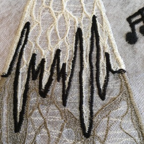
I then drew wave forms on the top design (see right pic above), these smaller wave forms were to include a word or two describing my father-in-law.
These photos (directly above) show the process of densely filling in the front panel.
This is the back panel (above), each panel is less dense than the one before. I also decided that the metronome in this size is too small to achieve such fine detail as planned on the top layer. So I created musical notes separately, so that they could be added afterwards, stitching them on to each panel, except the back panel. It was my intention to wire the notes coming out of the back, as if floating away. I thought they would add some movement to the piece.
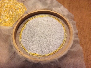
These photos show the completed panels still on the dissolvable fabric and then the musical notes and panels, trimmed and ready to assemble BEFORE washing out the fabric. This is a modification that I made from the construction of the first Metronome. When you wash out the panels there is slight shrinkage and they can be distorted by the time they have dried. Also the thread darkens when washed, so when you stitch it together with the same thread there is a noticeable colour difference.
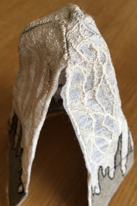
The photo on the left is partially constructed and still intact with the dissolvable fabric. On the right is the fully constructed, dissolved and dried object.
I really like the fourth panel with the open design, but still not sure about the finished object; feedback from my tutor was that it was too graphic. Unfortunately, it would appear that I am still guilty of being very obvious with my work – old habits can be hard to break.
Process – Washing out water soluble fabric
Posted: April 8, 2016 Filed under: Subject, Subject Level 6, Uncategorized Leave a commentHere is a short video showing the washing away of the water soluble fabric and moulding the textile sculpture on a form, which represents a metronome.
Treble Clef for Metronome
Posted: March 30, 2016 Filed under: Subject, Subject Level 6, Uncategorized Leave a commentI worked a design which incorporated a musical staff, base clef and a crotchet to make up the shape of a treble clef. It was my intention to fix it to the front of the metronome, but unfortunately it turned out to be too big and would have swamped the metronome.
Trial – Stargazer Lily
Posted: March 29, 2016 Filed under: Subject, Subject Level 6 Leave a commentI decided to create a very rough stargazer lily and try and form it, to see if the flower would hold its shape etc.
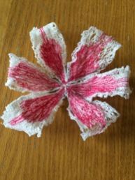
I drew the basic shape on the dissolvable fabric and using a fairly loose pattern ‘coloured in’ the petals. I also embroidered text around the edge of a couple of the leaves to see how it would look. After washing out the fabric I arranged the flower in a wine glass to hopefully achieve the correct shape.
The text was challenging on a small scale, but I liked the effect, so will need to perfect this technique.
On the whole I think it worked very well, so the plan is the make another one. However, this time I will make two sets of three petals, and layer them when the dissolvable fabric has been washed away, as I think it will look better.
Stargazer Lily
Posted: March 16, 2016 Filed under: Subject, Subject Level 6 Leave a commentMy mother-in-law used to sing in the choir at St Mary’s Church and was often asked to sing solo at weddings. She was artistic with a talent for producing the most beautiful wedding and occasion cakes, long before they really became popular. She took her inspiration from nature, especially flowers and butterflies. She also loved clothes, shopping, fairies and jewellery. However, I always think about her when I see a Stargazer Lily as it was one of her favourite flowers, so I have chosen to use this flower as the object I will create with her in mind.
I was recently bought some flowers that included a Stargazer Lily and took the opportunity to sketch it and play with some ideas that I have for the one I am going to make.
I looked at putting the text around the edge of the petals, as it will soften the edge. I think the next thing I need to do is try and rough out a flower in machine embroidery and dissolvable, to work through the logistics of constructing a flower in this medium.
Textile Text
Posted: March 16, 2016 Filed under: Subject, Subject Level 6 Leave a commentAs conversation is a major element in my work, I need to find the best way of incorporation written text in my projects, using the dissolvable fabric and machine embroidery. The problem I have, is that I just want the text and no base fabric, but if I am not careful this will unravel as soon as I wash the dissolvable away and I will be just left with unravelled thread.
I looked on Pinterest to see how other people incorporated text. These are some examples I liked, particularly the example on the right, but note it is paper and not textile.
I decided to experiment with a combination of machine embroidery, dissolvable fabric and paper.

This was a rough example of letters joined by a thin thread, however it wasn’t very successful when I washed out the dissolvable fabric. The structure became unclear and it looked quite messy. It is possible that if I pinned the piece in place on a board and then washed the fabric away, it might keep the structure better.
This was a little more successful as I used a small zig-zag stitch, which gives a better density to the text, but you can’t get very fine detail and you need the words to be a reasonable size otherwise the text is not clear to read. I will definitely experiment with this some more.
In the photo on the left, I have created a free machine embroidery panel and then on a separate piece of dissolvable attached to the top, stitched a phrase. When I washed out the fabric, the phrase was not very obvious, so I would have to consider back lighting to aid reading. It was still not very obvious, but I liked that fact as it added interest and would be good if I wanted to convey a hidden message.
In the photo on the right, I used paper letters sandwiched between two pieces of dissolvable fabric, but it wasn’t very successful, as the machine needle cut through the paper as I was sewing. I tried a thicker handmade paper which was better but not brilliant. However, this might be worth trying with various papers and explore the different results.
Alternative Tea Set
Posted: March 13, 2016 Filed under: Uncategorized Leave a commentI decided to look at the tea set differently and wondered if I made simple shapes in wire, could I attach the conversation text to them, so the conversation and tea set would be as one.

I quite liked the simple cup shapes, but the teapot might take a bit more work, as my daughter thought it was a lovely……….. chicken!
I can see her point – so maybe a rethink.
Another Metronome
Posted: March 4, 2016 Filed under: Subject, Subject Level 6, Uncategorized Leave a commentI had a tutorial with Pip on 15th February, where she suggested that I have some fun experimenting with design for the metronome, playing with musical notes etc. Here are the different designs I produced:-
I chose one and thought I would see how it looked when stitched. As the previous metronome had been very dark I decided to use a light colour to represent manuscript paper.
I liked the colour but after producing three sides I decided I wasn’t sure. However I stitched the three sides together before deciding that I felt the design was very obvious and I didn’t like it, so didn’t end up finishing it.
The Pocket Watch
Posted: February 20, 2016 Filed under: Subject, Subject Level 6 Leave a commentChoosing an object that I felt represented my late father was a fairly easy choice for me to make. He was a real Mr Fix-it and could turn his hand to pretty much anything. However, he had a real love for repairing watches and clocks, so I have decided to model a pocket watch based on the one he inherited from my maternal grandfather.
So today I started experimenting with the general idea of a pocket watch.
I am not sure about the colour as it seems very bright but I am really pleased with the stitch work on the back (left pic). I used a zig-zag stitch on the sewing machine, which I think has added an interesting texture.
My intention is to hand embroider the detail on the face and create the cogs and workings of the watch in machine embroidery and dissolvable fabric, but not necessarily have them inside the case. This would highlight the fact the watch is not working. I am thinking of showing that the watch stopped at 4.50 am, which is the time my dad died.
Reflection and Further Experimentation – Metronome No. 2
Posted: February 11, 2016 Filed under: Subject, Subject Level 6 Leave a comment
My initial attempt at the metronome was quite disappointing. I used the clear film dissolvable fabric and roughly drew the shape I wanted; I used white thread, a free motion action and a little felting wool to give more texture to the object. However, I did not like the outcome but this is what I learned from the first experiment:-
- I need a better way of drawing my design, as it is difficult to see on a clear film
- Drawing a straight line using free motion sewing is difficult and will need practice
- Using the same free motion action all over lacks interest, texture and structure
- Dissolving the individual sides and then stitching them together didn’t seem very successful as they shrunk and slightly distorted in shape
Following on from my first experiment I managed to source a white dissolvable fabric, that enabled me to draw a more detailed design directly on to the surface. This made it much easier to see when stitching and provides greater interest to the overall design.
After revisiting the work of Meredith Woolnough, I noticed that although her work appears lacy and fragile, the structure of the subject is quite thick and substantial, which holds its form well. Although she doesn’t appear to use a zig zag stitch, I have decided to use one for the outlining edges as this will also provided structure and strength. I also found the zig zig stitch easier to control in a long straight line.
I also tried stitching the sides together and dissolving the fabric as a whole. My thoughts on this were that the object will shrink together and not distort so much.
This is the process and result of my second metronome:-
